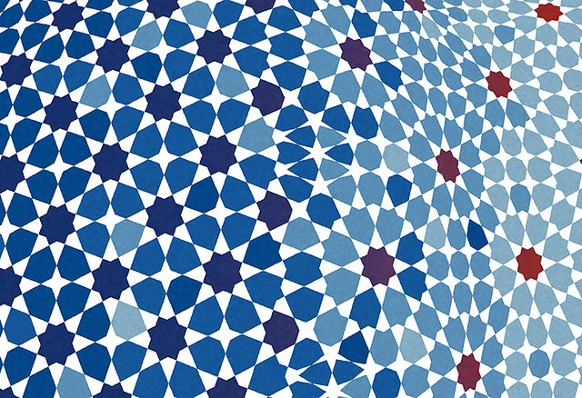
Earlier this year I received an email out of the blue from the director of a forthcoming production of Ayad Akhtar’s play Disgraced. The play is a compelling meditation on the nature of contemporary Muslim identity in America. One of the protagonists, Emily, is an American (non-Muslim) artist whose work explores themes from Islamic art. A painting of hers serves as a focal point for the set. It’s described in the stage directions as “A vibrant, two-paneled image in luscious whites and blues, with patterns reminiscent of an Islamic garden”. Later, in a conversation with her dealer Isaac, they discuss the composition in greater detail:
Isaac inspects the paintings for a long beat.
ISAAC: Mm-hmm… I have to admit… It has presence…
(Stepping back, assessing)
The surface tending toward the convex…
It’s a bending of the picture plane, isn’t it?EMILY: Exactly.
ISAAC: Which is why Jerry was talking about late Bonnard.
EMILY: The mosaics in Andalusia are bending the picture plane four hundred years before Bonnard. That’s what I mean. That’s what I was saying. The Muslims gave us Aristotle. Without them, we probably wouldn’t even have visual perspective.
I was asked whether I might be willing to create a new design that could be printed on canvas and used as a prop in the production. I was excited by the challenge. Of course there’s the intrinsic satisfaction of using my skills to create a novel design that meets the constraints imposed by Akhtar. But more than that, there’s the fact that like Emily, I’m an outsider studying Islamic art. It would be fun to step into the character’s persona and help her express herself artistically.

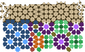
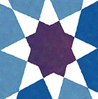
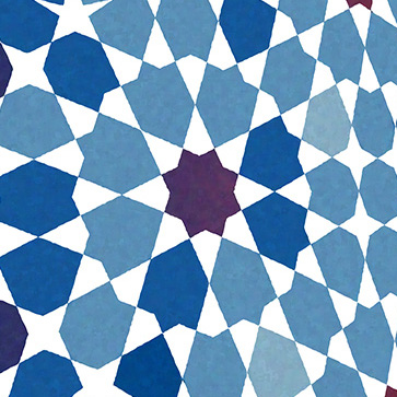
The base design is inspired by two distinct eightfold Islamic star patterns, which I arrived at by experimenting with an eightfold system of decorated rhombic tiles. I first learned of these rhombic systems from Jean-Marc Castera, who showed me tenfold tiles with similar properties. This rhombic system provides a natural, albeit somewhat irregular, mechanism for bridging the gap between these two patterns.
I exported these curves from Adobe Illustrator and imported them into Rhino 3D, where I was able to warp and twist the 2D curves in 3D in a freeform way. I then exported them back out as projected 2D curves, which I coloured manually in Illustrator. Finally, I opened the resulting vector illustration in Photoshop, and played with colours and textures to give the finished piece a bit of a painterly look, or at least something that would read well from the audience of a play.
I think the result does a reasonable job of capturing some of the intent of Akhtar’s directions. It’s an organic bending of the picture plane, not unlike Bonnard’s work. The blues and whites are reasonably luscious, though real paint would probably achieve a more luminous look. It’s not a two-paneled image, but I do juxtapose two very different arrangements of tiles.
A print of the piece appeared on stage in a Vienna Theatre Project production of Disgraced in February, directed by Joanna Goodwin-Seidl. They have a great collection of photos from the production online, many of which have the painting in the background.


Leave a Reply