I first learned of Burning Man from The Happy Mutant Handbook, a book of mayhem and counterculture that called out to me one day from a bookstore shelf. I’ve never participated in the festival, and probably never will, but I know many people who have and I suppose it has accumulated a quasi-mythological status in my worldview.
Late last year I met Brian Poindexter through a mutual friend from graduate school. Poindexter was part of a team that had been selected to create a large-scale art installation at Burning Man 2019. They were designing a pavilion that would be clad in wooden screens featuring Islamic geometric patterns. Poindexter saw some of my work in this area, and recruited me to create the geometric designs for the screens.
The pavilion as a whole went through several iterations over the next six months or so. By May it had settled down into a five-sided pyramidal tower with decorative fins. My “canvas” would be five large trapezoids (the pyramid was actually a frustum—it was to have a small opening at the top). One of the faces would have an arched passage at its base; the others would have oval windows.
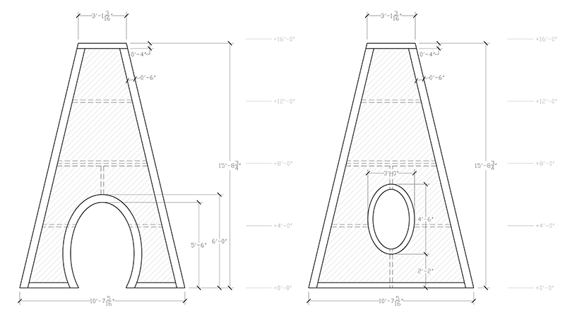
The team sent me CAD files for the sides of the pyramid, which was all I needed to start drawing prototypes. I explored three main ideas for the design; here, I’ve got the luxury of showing you the two designs that we rejected, together with the one we eventually picked.
Rejected design #1: Zellij
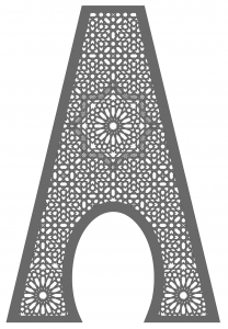
Zellij refers to a style of Islamic geometric patterns found in Morocco, based on assemblies of tightly fitting glazed terracotta tiles. The shapes of most of the tiles are related to the Seal of Solomon, an eight-pointed star formed from two overlapping squares. Designs often feature a large central star with as many as 96 points, with constellations of smaller stars radiating out from the centre.
I learned most of what I know about this style of design from Jean-Marc Castera’s books. Castera’s explanation of Zellij factors a pattern into a high-level “skeleton” that delineates large regions, and a few standard patterns of tiles that are then used to fill in those regions. This approach is convenient for my oddly shaped canvas—I had some freedom to choose a skeleton that put interesting features in eye-catching places. Above, a 16-pointed star hovers over the portal, surrounded by a hatched Seal of Solomon (reminding me just a bit of the Eye of Providence). Two more 16-pointed stars flank the portal near the ground.
In the end, this design was too busy. It might also have proven too difficult to manufacture, as this level of detail may not have been reliably cuttable from sheets of plywood.
Rejected design #2: Fourteen
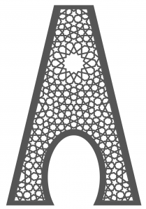
In a second approach, I imagined the trapezoid extended to a complete isosceles triangle, and calculated that the angle at the peak of that triangle would be around 26.9 degrees. That’s somewhere between 360/13 and 360/14. Hypothetically, then, it might be possible to fill the trapezoid with a design based on 13- or 14-fold rotational symmetry. A “wedge” taken out of such a design could be stretched to fit the trapezoid exactly, with lines of reflection symmetry running along the edges of the pyramid—mathematically, a very elegant idea! The hopefully imperceptible stretching even tickles my interest in near-misses.
Now, 13- and 14-fold geometry are quite rare (though not unheard of) in historical Islamic art, so there wasn’t a lot of precedent from which to draw. Fortunately, there’s some lovely contemporary work on the subject to serve as inspiration. In 2012, Jay Bonner and Marc Pelletier published a two-part paper (Part 1, Part 2) on systems for 7-fold Islamic patterns; Jay later published a lot of this material in his comprehensive book on the subject (to which I contributed a chapter). As it happens, the second of their papers had exactly the design I needed as a prototype: a pattern with 14-fold symmetry, from which I extracted a slice that I fit to the panel shape above.
Mathematically, this design works quite well; as you can see in the drawing, the sides of the trapezoid are lines of reflection of the original design. However, the team decided that it didn’t work as well aesthetically, which in the end takes precedence.
The winner: Alhambra
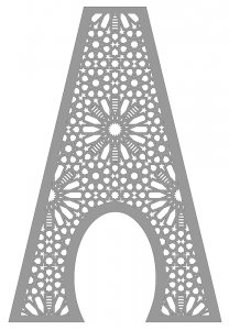
In the end, we ended up using a variation of one of the first patterns I proposed, really just as an initial example for testing. The design is a excerpt from a repeating pattern of 8- and 16-pointed stars, adapted directly from one of the most famous Islamic geometric patterns in history, found for example in the Alhambra in Spain:
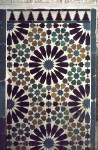
Interestingly, this pattern straddles the design traditions of the two rejected prototypes above. Its structure can mostly be accounted for through a kind of “polygons-in-contact” technique advocated by Jay Bonner, which he used for his 14-pointed design, but some of it definitely borrows from the Moroccan Zellij tradition. This is also, by the way, one of the patterns that M.C. Escher (and his wife Jetta) drew in sketchbooks while visiting the Alhambra, and which profoundly inspired his quest to create “regular divisions of the plane” from figurative animal forms.
After fine-tuning the placement of the design relative to the structure of the pavilion, and stealing the hatching from the Zellij prototype, the team in California decided to move forward with this plan.
The result
At this point (around July), Poindexter et al. went more-or-less incommunicado, as they worked on the serious challenges of actually manufacturing parts that could be hauled out to the playa and assembled. Indeed, I heard so little over the next couple of months that I didn’t even know if they had succeeded! Happily, after the dust had settled (har har) on Burning Man 2019, we reconnected and I finally got to see the results of our work.
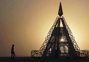
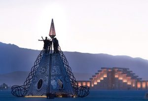
The results are quite lovely! Many great photos of the installation can be found online, for example at DesignBoom and Dezeen. There’s an official website for the project, which will hopefully also be updated soon with a post-Burning Man report.
I didn’t know a lot about the inspiration for the project while I was working on it. Later I learned that it had been envisioned by the prominent architect John Marx, while Poindexter and many others formed the “Playa Muses”, who put the work together and brought it to Burning Man. The project as a whole was intended as an homage to heroic women and female empowerment, which makes me even happier to have participated.
Without ever having been to Burning Man myself, I hope I have managed to make a small contribution to its mythology, as part of an artwork that explores decidedly mythological themes.

Leave a Reply