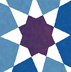

I’ve always loved the Ishihara tests (pages printed with patterns of coloured dots, used to diagnose different forms of colour vision deficiency, or CVD). They’re beautiful works of graphic design. Years ago I bought a used copy of a complete set of tests, and framed some of them to hang in my house.
Reflecting on these tests, I had been thinking for a few years about possible ways to create artworks that somehow take advantage of CVD. It would presumably be easy enough to generate a design that’s comprehensible to someone with trichromacy (normal colour vision) but whose content is obscured or lost completely by someone with dichromacy (in which one of the three types of cones in the human eye is weak or absent). But what would be gained? Many aspects of the designed world implicitly assume trichromacy, to the annoyance of people with CVD. Much more interesting would be to create designs that only make sense to someone with CVD. I imagined something like camouflage: a design that would look like a riot of colour to a trichromat like me, but which would resolve into a calmer, legible composition to someone with the right form of dichromacy.
With only a bit of research, it became clear that this idea isn’t really new. Most obviously, some of the Ishihara plates themselves are designed to work this way. The collection includes “hidden image” plates (where a trichromat sees nothing, and a dichromat sees a number), and “transformation” plates (where trichromats and dichromats see different numbers). I also found one artist, Carol Man, who experimented with paintings of this form. There’s even some evidence that the camouflage idea mentioned above might represent a real evolutionary trait in some animal species. A subpopulation of individuals with CVD are better able to warn the herd about the presence of camouflaged predators, while everyone else uses full colour vision to find the best food.
Eventually I was able to put together some software to generate various kinds of images that embed information visible only for dichromats (to keep things simple I focused only on deuteranopia, the common form of red-green colour blindness, though the techniques can be adapted to other types). I built my code on top of the excellent DaltonLens Python library, and relied heavily on a deep dive into software simulation of CVD written by the author of DaltonLens, Nicolas Burrus. Here are a few examples of images I created.
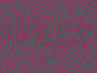
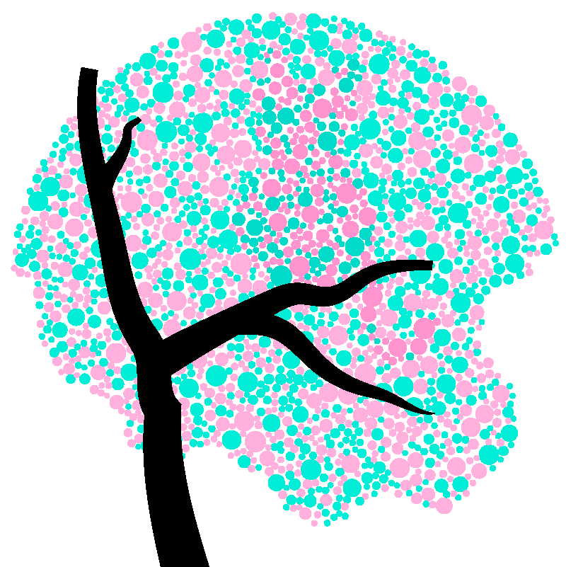
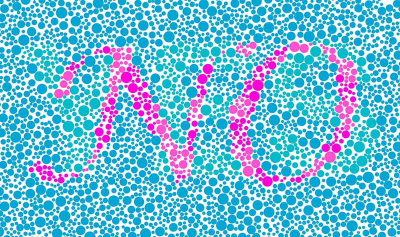
Overall I wasn’t all that satisfied with this work. By definition these images are extremely brittle: the embedded information needs to be as faint as possible to hide it from a trichromat, while still strong enough to jump out at a deuteranope. And even if there were some ideal way to tune the algorithm to yield “perfect” steganography, that ideal is then necessarily filtered through multiple layers of computation, colour space conversions, resampling, and monitor settings, and then viewed in an environment with uncontrolled lighting. (And of course, as a trichromat I’m not in a good position to evaluate the results myself.) The upshot is that the hidden information in these results is fairly visible to trichromats.
Still, this was a good opportunity for me to study up on the topic of colour perception and CVD. I like the core idea of producing images like these, and the process turned up some nice mathematical and algorithmic ideas. So in the end I thought it was worth writing a paper and sharing the work. You can find all the details in my Bridges 2023 paper.
Leave a Reply